- Version 10.0.1
- Project Flyweb Production
- Section blog
- Tags
development, newsletter, html, css
Published This Post is a few years old and the Information provided might be out of date!
Case Study: tip-daily Newsletter
Responsive re-design for a daily tourismnews Newsletter
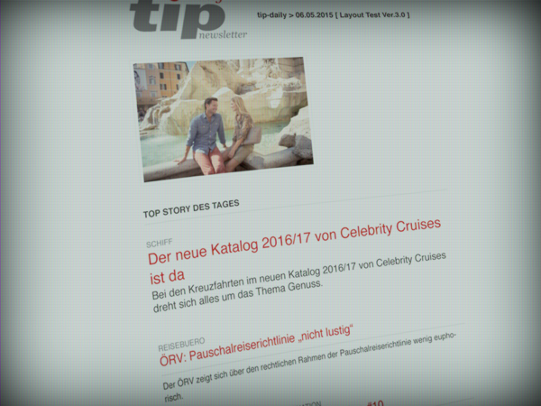
This project was commissioned by Profi Reisen Verlag in Vienna, Austria. The company already owned a Newsletter Service based on a CRM, build by yours truly. From Monday to Friday the "tip-daily" Newsletter delivers news from the Austrian Travel Industry to about 3.500 readers.
Edit June 2020: added new Screenshots
Job Description
A Layout update was necessary since the old HTML Template had not been displayed correctly on mobile devices. Besides that, the Content — which is generated from via a CMS (textpattern) and a CRM — needed to be extended. When the editorial team sends a Newsletter, all articles used should be flagged as "sent" in the database. And of course the Marketing team needs some new banner placeholders. The generated Newsletter should also include a HTML and a plain Text version.
Content Blocks
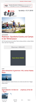
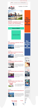
- HEADERBANNER 468x60
- NEWS - up to 10 articles
- CONTENTBANNER 468x60
- SECTION 1 - (display optional) max. 1 article
- SECTION 2 - (display optional) max. 1 article
- SECTION 3 - (display optional) max. 1 article
- SECTION 4 - (display optional) max. 1 article
- SECTION 5
- SUB-SECTION 5.1 - max. 10 articles
- SUB-SECTION 5.2 - max. 10 articles
- SUB-SECTION 5.3 - (display optional) max. 3 articles
- FOOTERBANNER 468x60
- SECTION 6 - max. 10 articles
- SKYSCRAPER BANNER 160x600 - (displayed optional, when present display a SIDEBAR)
Workflow
The first step was to prepare a Layout mockup to present and discuss with the team. The next step was to build up the grunt taskrunner to help generating and building the new Email Layout. Afterwards, the backend needed to be adjusted to create Newsletters via a HTML form as well as to automatically select the subscribers email addresses. This form should then display the CMS articles to the editorial team and also offer the possibility to re-order the news articles.
HTML-Layout
From previous responsive HTML Newsletter projects, I already had some good experience with the Ink Framework from ZURB and with that, the decision to use this Framework was quickly made. The final Email template should also have in-lined most of the CSS code and minimized the HTML code.
Time-travel back to the 90's
Creating an HTML Newsletter which should have a consistent appearance (as good as possible) on all devices and screens means a lot of tedious work with good ol' HTML tables. The Ink Framework is no exception in case of using HTML tables, but it provides custom HTML tags which can be used to create a Layout. This is a big help with all those nested table elements. These custom tags can later be converted into valid HTML with the tool inky, this helper can be used with task runners like gulp or grunt.
Helpers
A great resource for HTML Emails can be found at "The Ultimate Guide to CSS" from Campaign Monitor and also Can I email is very useful to figure out what is supported by Email Clients. You also might try mail tester which can be used to find Spam triggers, missing images, correct DNS server settings etc.
PHP Backend
The tricky part was to implement the changes while the old Newsletter was still in use. This resulted in some spaghetti code and a few grey strands of hair. After the release the old code was removed and the hair was kept.
The dynamic newsletter content is generated with PHP and stored in a mySQL database. For the HTML content the good ol' PEAR flexy template engine was used to glue everything together. This resulted in some HTML snippets which looked like the following example:
<table class="row content" cellspacing="0" cellpadding="0" style="border-spacing:0;border-collapse:collapse;vertical-align:top;text-align:left;padding:0;width:100%;position:relative;display:table" width="100%" valign="top" align="left">
    <tbody>
    <tr style="padding:0;vertical-align:top;text-align:left" valign="top" align="left">
        <th class="small-12 large-12 columns first last" style="color:#68676c;font-family:Helvetica,Arial,sans-serif;font-weight:400;padding:0;text-align:left;font-size:16px;line-height:1.4;margin:0 auto;Margin:0 auto;padding-bottom:12px;width:600px;padding-left:12px;padding-right:12px" align="left">
            <table cellspacing="0" cellpadding="0" style="border-spacing:0;border-collapse:collapse;padding:0;vertical-align:top;text-align:left;width:100%" width="100%" valign="top" align="left">
                <tbody>
                <tr style="padding:0;vertical-align:top;text-align:left" valign="top" align="left">
                    <th style="color:#68676c;font-family:Helvetica,Arial,sans-serif;font-weight:400;padding:0;margin:0;Margin:0;text-align:left;font-size:16px;line-height:1.4" align="left">
                        <br>
                        <hr style="color:#cacaca;background-color:#cacaca;border:0;height:1px;border-bottom-color:#cacaca">
                        <h2 style="padding:0;margin:0;Margin:0;text-align:left;color:inherit;word-wrap:normal;font-family:Helvetica,Arial,sans-serif;font-weight:400;margin-bottom:10px;Margin-bottom:10px;font-size:24px;line-height:1.2">
                            <small style="color:#4f4e52;font-size:70%;font-weight:400">{subheader:h}</small><br>
                            <a href="{url:h}" class="grey" style="font-family:Helvetica,Arial,sans-serif;font-weight:400;padding:0;margin:0;Margin:0;text-align:left;text-decoration:none;color:#4f4e52;line-height:inherit">
                                {header:h}
                            </a>
                        </h2>
                    </th>
                </tr>
                </tbody>
            </table>
        </th>
    </tr>
    </tbody>
 </table>
Final Words
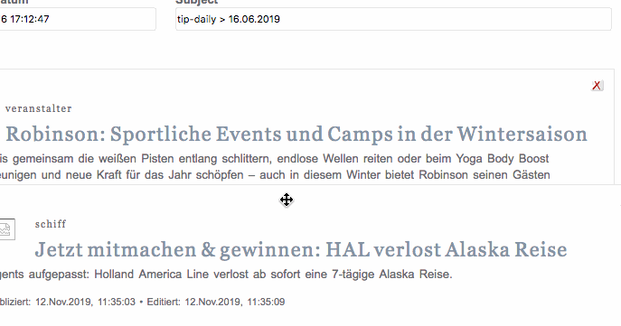
After the backend was finished, the editorial team could create Newsletter campaigns with so much as the click of a button. The campaign would automatically collect all subscribers and create content from the newest articles. The team could then use the form to set the mailing date, change the subject and re-order the news articles with drag & drop as shown below.
The new Newsletter system was a great improvement to the previous one, creating and generating now takes a lot less time than before. Also the new responsive Layout improves the readability and reading experience for all subscribers, allowing them to enjoy the content on their device of choice. And last but not least, the marketing team has new possibilities to monetize the product.
Examples
The following examples show how the Newsletter looks on desktop and mobile devices. The Newsletter can also be viewed at www.tip-online.at/newsletter/